Different versions of logo designs have always mattered a lot in the history and evolution of all famous companies. Only a good logo design can make people instantly recognise a brand or a company and make them attracted to it. This month, we are going to tell you about the evolution of the logo design of the famous company; Amazon.
In The Year 1995

The very first logo of Amazon was the literal interpretation of the company’s name. At that time their slogan was known as the “Earth’s biggest bookstore”. With a blue background and the letter ‘A’ that had the shape of a river inside, it stayed the company’s logo for two years but it was criticised a lot due to its poor quality. But in their defence, it was the start of the digital era and it was created with very poor-quality tools.
In The Year 1997

The year 1997 was important in the logo history of the Amazon company as they replaced their logo design with a more professional one. They removed the blue background company but kept the letter A and the river inside. But instead of their slogan, it became amazon.com. They were able to predict that in the future the dot-com system would become a hype. But of course, it wasn’t enough afterwards as they changed it again the very next year.
In The Year 1998
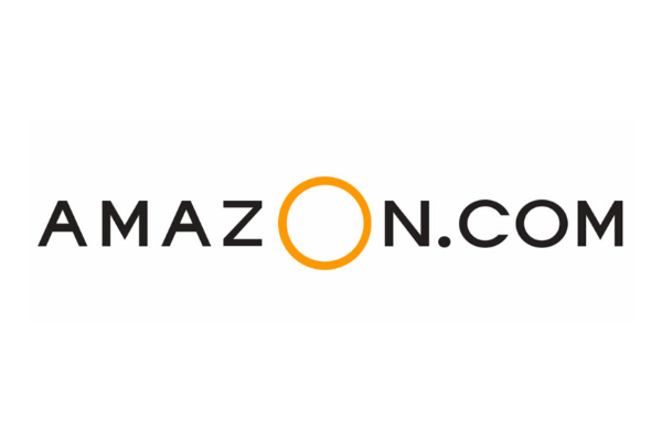
In this year, the logo design had such a drastic change, it gave a very modern look to it. The logo was quite simple with only the word amazon.com written. The word amazon was written in capital letters in which the letter O was a giant yellow ring.
In The Year 1998-2000

But unfortunately, the previous logo didn’t survive even for a year. They removed the uppercase approach and made it fully lowercase. The company thought this looked more approachable. Another change in this was that although the font was black in colour, it was underlined with a curved orange line. The logo designers chose to do this because it is said that orange represents joy and warmth which made the company looked friendlier. On the other hand, black represents dominance and elegance.
In The Year 2000

The logo that was created in this year is quite similar to today’s logo. The orange line has been made into a curved arrow which goes from A to Z. this logo reflects the drastic growth of the company. The arrow represents that the company can provide everything from a to z. Moreover, they added “and you’re done” below amazon.com. This logo stayed the same for 12 years.
In The Year 2012-Present
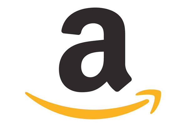
In 2012, they officially stepped into the modern digital world by becoming a success for the past 12 years. The logo design went through a lot of changes again. It was initially created by Turner Duckworth. The company dropped the whole “.com and you’re done” part. This proved very well about the company’s success as only the name amazon was sufficient for people to recognise the company.
The logo history of Amazon shows that a logo design should be updated according to the company’s success and evolution. If you want to update your company’s logo design, you can come to Purpple Designs, a logo design company in Kolkata.
Recent Posts
Archives
- April 2025
- March 2025
- February 2025
- January 2025
- December 2024
- November 2024
- October 2024
- September 2024
- August 2024
- July 2024
- June 2024
- May 2024
- April 2024
- March 2024
- February 2024
- January 2024
- December 2023
- November 2023
- October 2023
- September 2023
- August 2023
- July 2023
- June 2023
- May 2023
- April 2023
- March 2023
- February 2023
- January 2023
- December 2022
- November 2022
- October 2022
- September 2022
- August 2022
- July 2022
- June 2022
- May 2022
- April 2022
- March 2022
- January 2022
- December 2021
- November 2021
- October 2021
- September 2021
- August 2021
- July 2021
- June 2021
- May 2021
- April 2021
- March 2021
- February 2021
- January 2021
- December 2020
- November 2020
- October 2020
- September 2020
- August 2020
- July 2020
- June 2020
- May 2020
- April 2020
- March 2020
- February 2020
- January 2020
- December 2019
- November 2019
- October 2019
- September 2019
- August 2019
- July 2019
- May 2019
- April 2019
- March 2019
- February 2019
- December 2018
- November 2018
- August 2018
- July 2018
- June 2018
- May 2018
- April 2018
- March 2018
- February 2018
- January 2018
- December 2017
- May 2016
- December 2015
Categories
- Business Card (2)
- Corporate Identities (1)
- Digital Marketing (75)
- Graphic Designing (29)
- Logo Design (63)
- Packaging Design (4)
- Social Marketing (29)
- Social Media Marketing (5)
- Uncategorized (7)
- Visiting card (2)
- Web Design (17)
- website design and devlopment (11)


